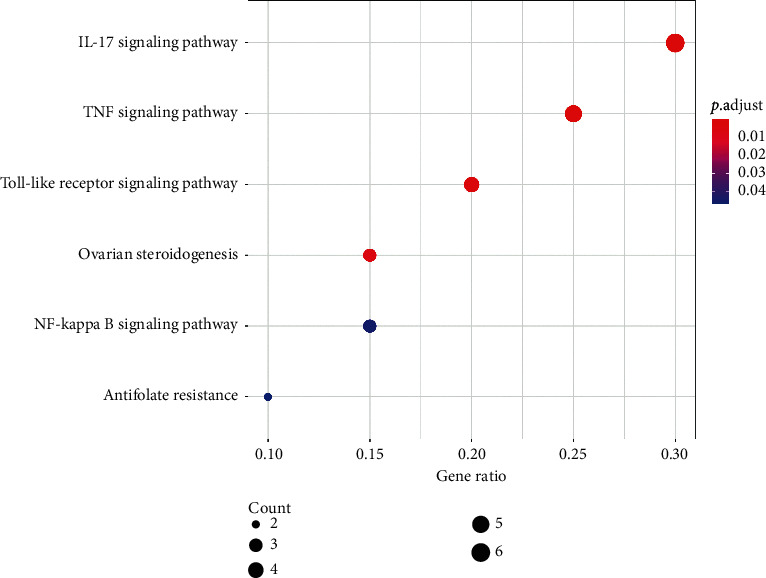
Figure 5.

Bubble graph of KEGG pathway enrichment analysis. Each bubble represents a KEGG pathway on the vertical axis. The gene ratio is recorded on the horizontal axis. The size of each bubble indicates the number of genes enriched in each KEGG pathway. Larger the bubble is, more number of genes is involved in the pathway. Color of each bubble represents the adjusted P value of each KEGG pathway. More red the color of the bubble is, smaller its adjusted P value is. Abbreviation: KEGG, Kyoto Encyclopaedia of Genes and Genomes.
