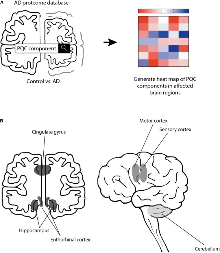
FIGURE 1.
Schematic representation of approach. Schematic overview of the rational of our analysis. (A) Protein expression levels were obtained from the Alzheimer’s Disease Proteome Database and compared between 9 AD brains and 9 age-matched control brains (Xu et al., 2019). Heat-map was created to illustrate the protein level changes according to brain region. (B) Schematic representation of analyzed brain regions. Brain regions are colored along a gray gradient by affectedness, ranging from mostly unaffected (cerebellum, light gray) to mildly affected (sensory and motor cortex, medium gray), to severely affected (hippocampus, entorhinal cortex and cingulate gyrus, dark gray).

