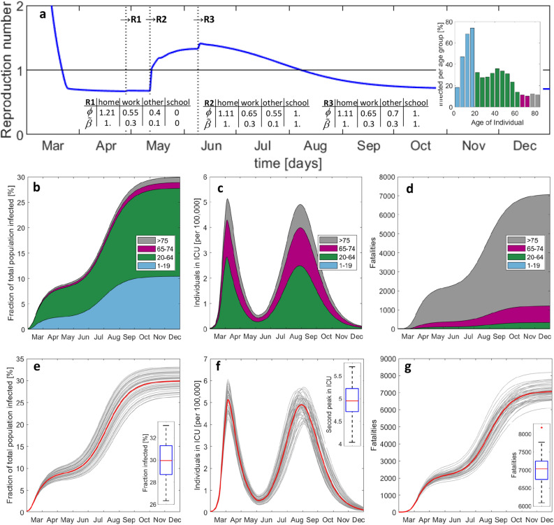
Figure 7.
Predicted evolution of the epidemic after step-wise release of measures including school reopening without special caution. Histories of (a) average reproduction number, (b) total number of exposed, (c) individuals in ICU, and (d) accumulated fatalities. The vertical lines in (a) indicate the instants of release measures #1 to #3. The inserted bar plot shows the infected per age-group by December 2020. (e–g) Results from Monte-Carlo analysis. The 50 Gy curves in each plot are obtained after a random perturbation of the main model parameters, while the red curve corresponds to the respective deterministic solution reported in (b–d). The boxplots show the median (red), the 25th and 75th percentiles (in blue), the extreme data (black) and outliers (red star symbol).

