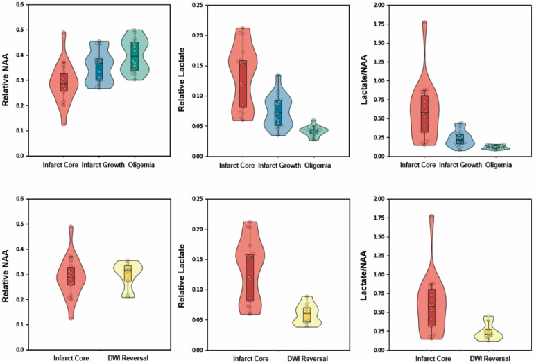
Figure 4.
Comparisons of mean relative NAA, lactate, and lactate/NAA among different regions within hypoperfused tissue (top) and DWI lesion (bottom). Boxes indicate the interval between 25th and 75th percentiles; horizontal lines indicate median values; whiskers indicate the interval between 1.5 times the interquartile range above the 75th percentile and the corresponding distance to the 25th percentile value. Violin plots show the distribution of the data using kernel density estimation with automatic bandwidth selection.

