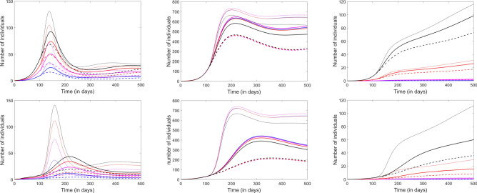
Figure 9.
Effect of lifting closures and relaxing social distancing after 100 days. From left to right, the panels represent the infected, the recovered and the fatalities compartments. Each age group is represented in one color: Children (blue), Young adults (pink), Adults (red) and Elderly (black). The dashed curves illustrate the prediction with closures and social distancing in place. The thin solid curves illustrate the prediction with both closures and social distance restrictions lifted. The thick solid curves represent a scenario in which closures are lifted, but social distancing is maintained. In the top panels, is reduced by 20% with social distancing; in the bottom panels, it is reduced by 40%.

