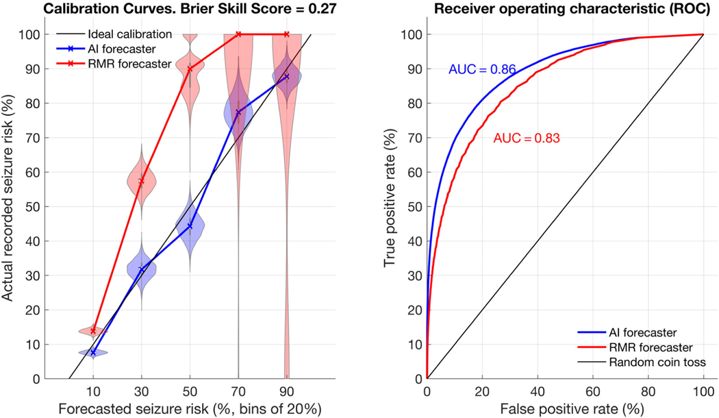
FIGURE 3:
Calibration and receiver operator characteristic (ROC). Calibration shows the relationship between actual recorded seizure probability and seizure forecast values. The rate-matched random (RMR) and artificial intelligence (AI) forecasters are shown in the left calibration curve with violin plots. On the right, the ROC plot compares both forecasters directly. For calibration plots, 5 bins of size 20% were used, meaning forecast values from 0–20, 20–40, 40–60, 60–80, and 80–100 are summarized in the figure along the x-axis. The ideal calibration for a hypothetical perfect forecaster is shown as a dotted black line. The violin plots represent a histogram of values, allowing a clear representation of the spread of values observed. The wider the plot becomes, the more likely a given value was. For instance, when RMR forecasted 20–40%, the true risk often was 60–75%. The calibration curve intersects the median values from each violin plot. RMR shows very poor calibration, particularly at higher forecast values, whereas the AI shows good calibration (ie, close to the idealized calibration curve). Of note, RMR rarely forecasted high-valued (>80%) forecasts, but when it did the true risk was always very low. The ROC plot shows the AI consistently outperforms RMR for any given threshold. AUC = area under the ROC curve.

