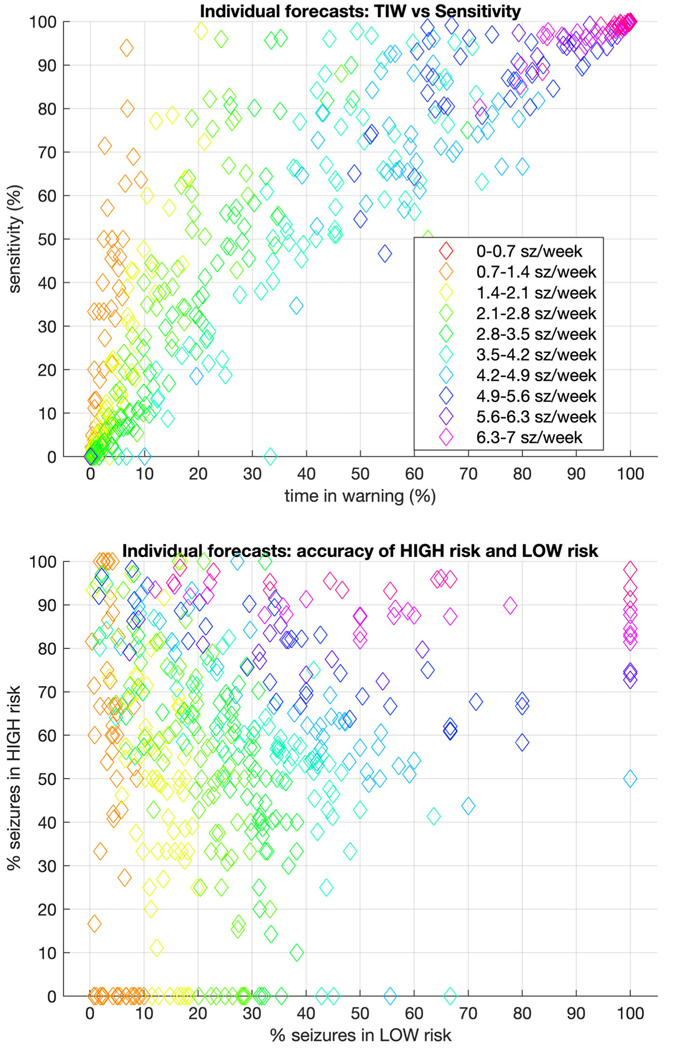
FIGURE 5:
Individual level forecasting metrics for dichotomized forecasts. Taking the optimal threshold cutoff for each patient, forecasts were recasts as “high risk” versus “low risk.” In that context, the upper graph compares time in warning (TIW) to sensitivity, whereas the lower graph compares the accuracy of high-risk to low-risk forecasts. In both, the color of each marker indicates the seizure rate for that patient. The ideal for the upper figure would be very low TIW (which would depend on seizure rate) and extremely high sensitivity. The ideal for the lower figure would be 0% seizures in low warning, and 100% seizures in high warning. sz = seizures.

