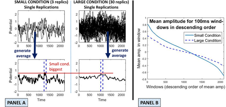
Fig 3. Illustration of (simple) averaging bias.
Two conditions with different replication counts were generated according to the properties introduced in section “Simulations”. The Small condition has three replications and the Large 30. A deliberately large asymmetry is considered for clarity of illustration. Panel A: Single replications are depicted overlaid in the upper two subpanels. Averages for these two conditions are depicted in the lower two subpanels. As would be expected, the Small condition average exhibits more noise and thus, more extreme values than the Large condition average. Accordingly, its highest mean amplitude is higher than for the Large condition, as illustrated with the red horizontal line. The blue dashed vertical lines indicate the highest amplitude 100 ms interval. Panel B: The property illustrated in Panel A that more averaging reduces extreme values, both highest (most positive) and lowest (most negative) amplitude, is illustrated more generally. The simulation of Panel A was run 100 times. In each simulation, we calculated the mean activity in a 100ms window at all possible locations at which the window could be placed on the average. We did this separately for the Small and Large conditions. Within each condition, we then sorted the window means from highest (leftmost) to lowest (rightmost) in panel B. This vector of highest to lowest mean amplitudes was then averaged across the 100 simulations, to obtain a (central tendency) estimate of the sequence of mean amplitudes in descending order. This was done for both Large and Small conditions and plotted in Panel B.

