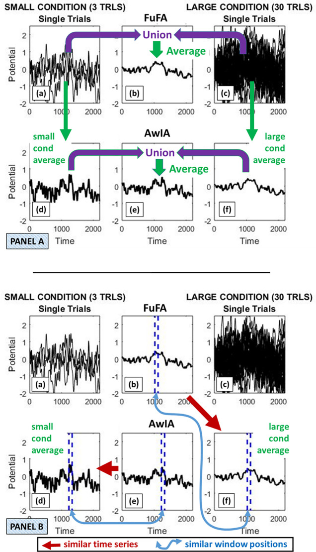
Fig 4. Illustration of bias due to window selection using the same simulation run as in Panel A of Fig 3.
The top panel of this figure (Panel A), depicts how the FuFA and AwIA are generated. That is, the FuFA is an average of the union of all the replications from the two conditions. In contrast, the AwIA is an average of two time-series: the average of the Small condition and the average of the Large condition. The union in this case would contain two time-series, which are then averaged. Panel B shows that the FuFA and AwIA procedures generate very different time-series. Specifically, the key landmarks (e.g., maximum/minimum points) of the AwIA tend to correspond to those of the Small condition average. This is because the Small condition average has more extreme amplitudes, due to the (simple) averaging bias, so they “swamp” the less extreme amplitudes of the Large condition average, when the AwIA is generated. In contrast, the FuFA tends to be more like the Large condition average, since all single-replications contribute equally to it and there are more single-replications in the Large condition. This tendency can be seen in the window placements. Windows are placed in the FuFA, AwIA, average Small and average Large, with, in each case, the 100ms window with the highest mean amplitude selected, and shown by the blue dashed vertical lines. The AwIA window ends up at a similar position to in the Small condition average, while the FuFA window ends up at a similar position to in the Large condition average.

