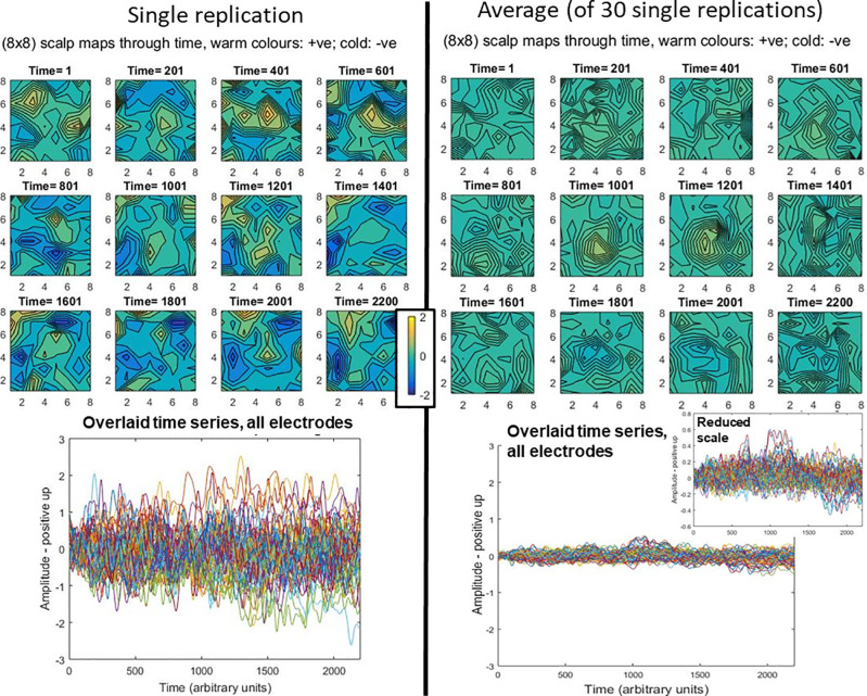
Fig 5. Illustrative data generated under null-hypothesis simulation.
The left side shows a typical single replication, while the right side shows a typical average, here generated from 30 replications. In both cases, we present the same data in two different ways. First, (at the top) scalp topographies through time are presented, with the two topography sequences using the same colour scale to aid comparison. Second, (at the bottom) the time-series at each electrode are presented overlaid in the same plot. The two main plots have the same scale to aid comparison between amplitudes of single replication and average. Consistent with the averaging bias, the single replication contains much more extreme deflections (both positively and negatively). This can be seen in the more extreme colours in the left-hand scalp topographies, and the larger amplitudes in the left-hand overlaid time-series plot. The reduction in extreme amplitudes evident on the right side due to averaging, has enabled the signal to emerge. This can be seen as a positive deflection at the centre of the grid, at time-points 1001 and 1201, and a negative one also at the centre of the grid, in the time-range 1801–2200. As would be expected, the overlaid time-series plot of the average shows the signal landmarks in the same time periods, see particularly, inset plot on the right.

