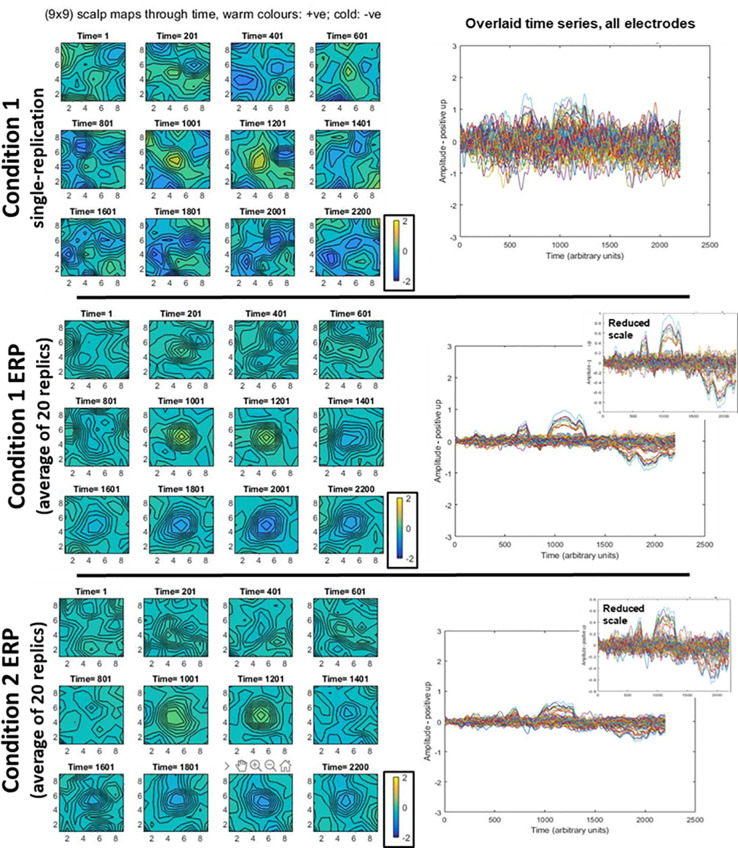
Fig 9. Illustrative data generated for statistical power simulations.
In all rows, we present the same EEG data in two different ways. On the left, scalp topographies through time are presented, with all three topography sequences using the same colour scale to aid comparison. On the right, time-series at each electrode are presented overlaid in the same plot. The first row shows a typical singe-replication for condition 1; the same plot for a condition 2 replication would look similar, since the amplitude difference of the signal is swamped by noise. The second row shows a typical condition 1 average (ERP), here generated from 20 replications and the third row shows the same, but for condition 2. All the main time-series plots have the same scales to aid comparison between amplitudes of a single replication and averages. As would be expected, the single replication contains much more extreme deflections (both positively and negatively). This can be seen in the more extreme colours in the top-row scalp topographies, and the larger amplitudes in the corresponding overlaid time-series plot. The reduction in extreme amplitudes evident on the right side due to averaging, has enabled the signal to emerge. This can be seen as a positive deflection at the centre of the grid, at time-points 1001 and 1201, and a negative one also at the centre of the grid, in the time-range 1801–2200. As would be expected, the overlaid time-series plot of the average shows the signal landmarks in the same time periods, see particularly, inset plots on the right. Condition 1 has higher signal amplitude than condition 2.

