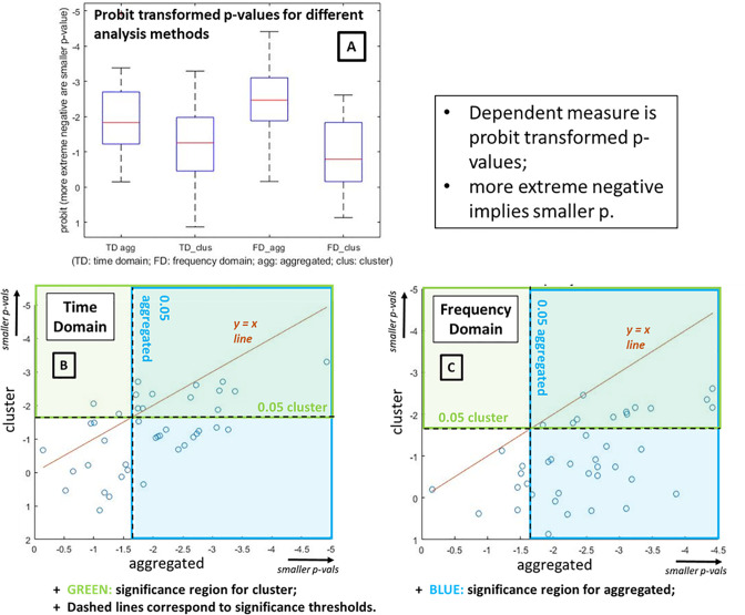
Fig 11. Simulation results, expressed as probit transformed p-values.
[A] Main results depicted as box-plots for time-domain aggregated average, time-domain cluster-based analysis, frequency domain aggregated average and frequency domain cluster-based analysis. Red markers indicate the median; bottom and top edges of boxes indicate the 25th and 75th percentiles, respectively; whiskers extend to most extreme non-outlier data points; and “+” symbols mark outliers. [B, C] Scatter plots show that, as one would expect, the aggregated average and cluster analysis generate correlated results. Note, the brown line is not a line of best fit, it is simply the identity line: Y = X. Data sets in which the aggregated average gives a smaller p-value than cluster inference appear below the Y = X line and those where cluster inference does better appear above it. The 0.05 p-value threshold corresponds to a probit transformed value of -1.6449. We show where this threshold sits with green and blue dashed lines. As a result, the points in the green region are significant by cluster inference and blue by aggregated average. Time domain aggregated has 25/40 significant, time domain cluster has 14/40, frequency domain aggregated has 32/40, and frequency domain cluster has 12/40. These scatter plots show again that, for these simulations, the aggregated average is more effective, giving more statistical power, than cluster-inference, and that this is especially the case in the frequency domain.

