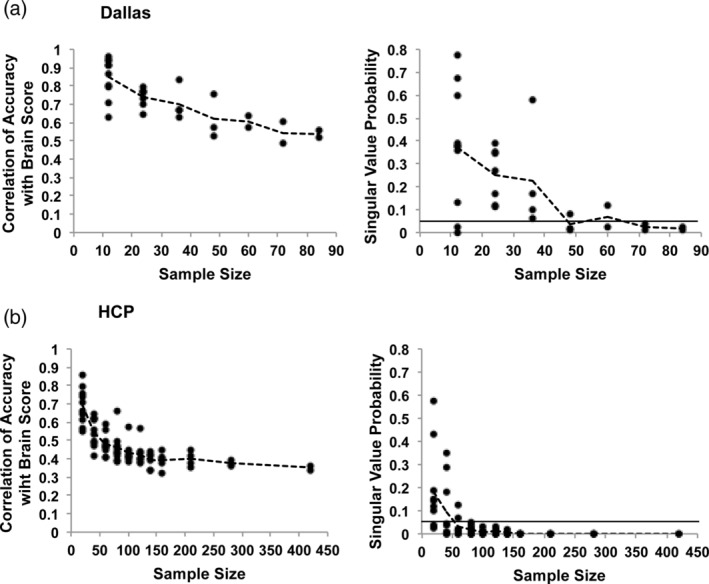
FIGURE 3.

The results of the PLS analyses of brain‐behavior correlations are shown for the Dallas (a) and HCP (b) data sets. The left‐hand graphs show the correlations between accuracy and brain scores for all samples at each sample size (the dashed line joins the mean values at each sample size). The right‐hand graphs show the LV p values (from the permutation test) for all samples at each sample size (the dashed line joins the mean values at each sample size). The solid line indicates p = .05
