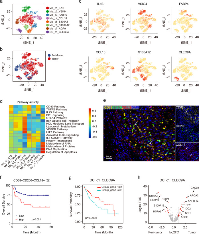
Fig. 2. Identifying distinct myeloid cell clusters in HCC.
a t-SNE projection of eight subsets of myeloid cells (each dot corresponds to one single cell) shown in different colors. b t-SNE plots of different myeloid cell clusters origin. c Expression of marker genes for each cluster illustrated in the t-SNE plots. d Heatmap of the differences in pathway activities scored per cell by GSVA analysis. e Representative mIHC images to show the distribution of CD68+CD206+CCL18+ macrophages: CD68 (yellow), CD206 (green), CCL18 (red), and DAPI (bule). White arrows (CD68+CD206+CCL18+), blue arrow (CD68+CD206+CCL18−). Scale bar, 50 μm. f Kaplan–Meier curve showing poor survival in patients with high proportion of CD68+CD206+CCL18+ macrophage vs low proportion (log-rank test, P = 0.001) in our cohort. g Kaplan–Meier curves of survival for the TCGA HCC patients grouped by the average expression (high versus low) of DC_c1_CLEC9A cell marker genes as annotated in Table S3. (log-rank test, P = 0.0036). h Volcano plot showing differentially expressed genes in DC_c1_CLEC9A cells between peri-tumor and tumor. Each red dot denotes an individual gene passing our P value and fold change thresholds.

