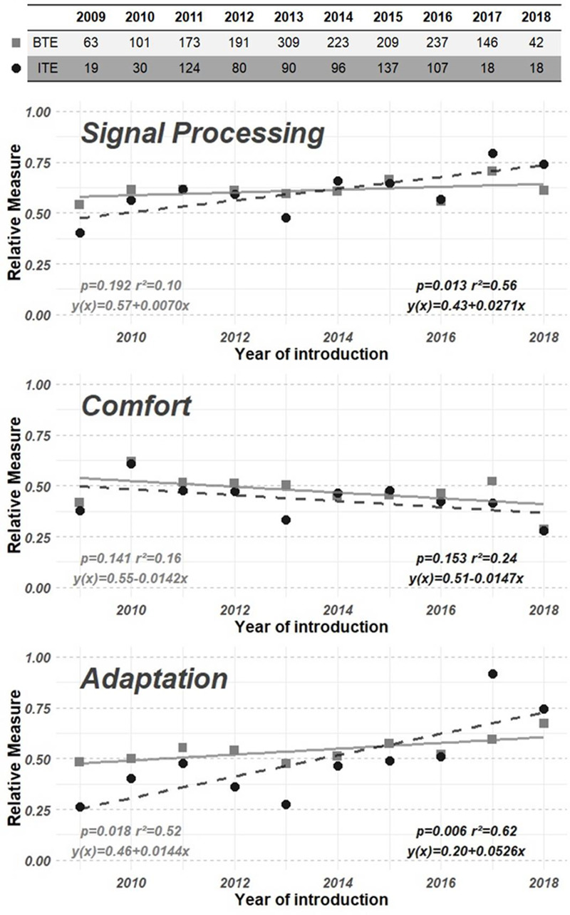
Fig. 6.

Top of the table shows the number of hearing aids included in the analysis, for each year of introduction and hearing aid style type. The three graphs show rescaled mean hearing aid feature potential per domain (y axis) for grouped hearing aids (BTE: light grey squares; ITE: dark grey dots), plotted against the year of introduction (x axis) from 2009 up to and including 2018. The x axes of all three graphs share the same grouped hearing aids per year of introduction, and a linear model was fitted on each of the domain-specific data. The top graph shows the domain signal processing. The middle graph shows the domain comfort, and the bottom graph shows the domain adaptation. BTE indicates behind-the-ear; ITE, in-the-ear.
