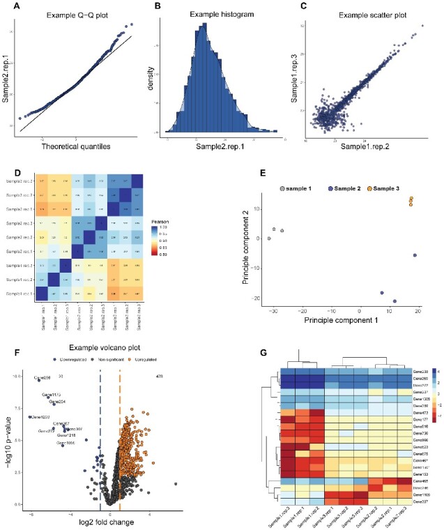
Fig. 1.

Representation of the various graphs that can be created by Provision using the tutorial data. Quality control plots include (A) Q–Q plots, (B) histograms, (C) scatterplots, (D) correlation heat maps and (E) principle component analysis. Main figures include (F) volcano plots and (G) heat maps. Multiple parameters of every plot can be customized to user preference
