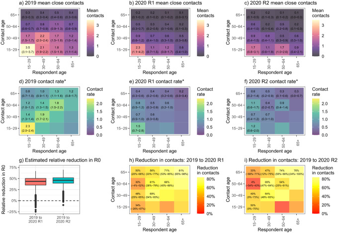
Figure 2:
Age-stratified mean (95% plausible range) number of close contacts from survey respondents
Graphs a-c show the mean number of contacts respondents in each age group reported, by contact age group.
Graphs d-f show the mean rate of contact between respondents in each age group and each other person in the target population, by contact age group.
*numbers shown are rates × 105.

