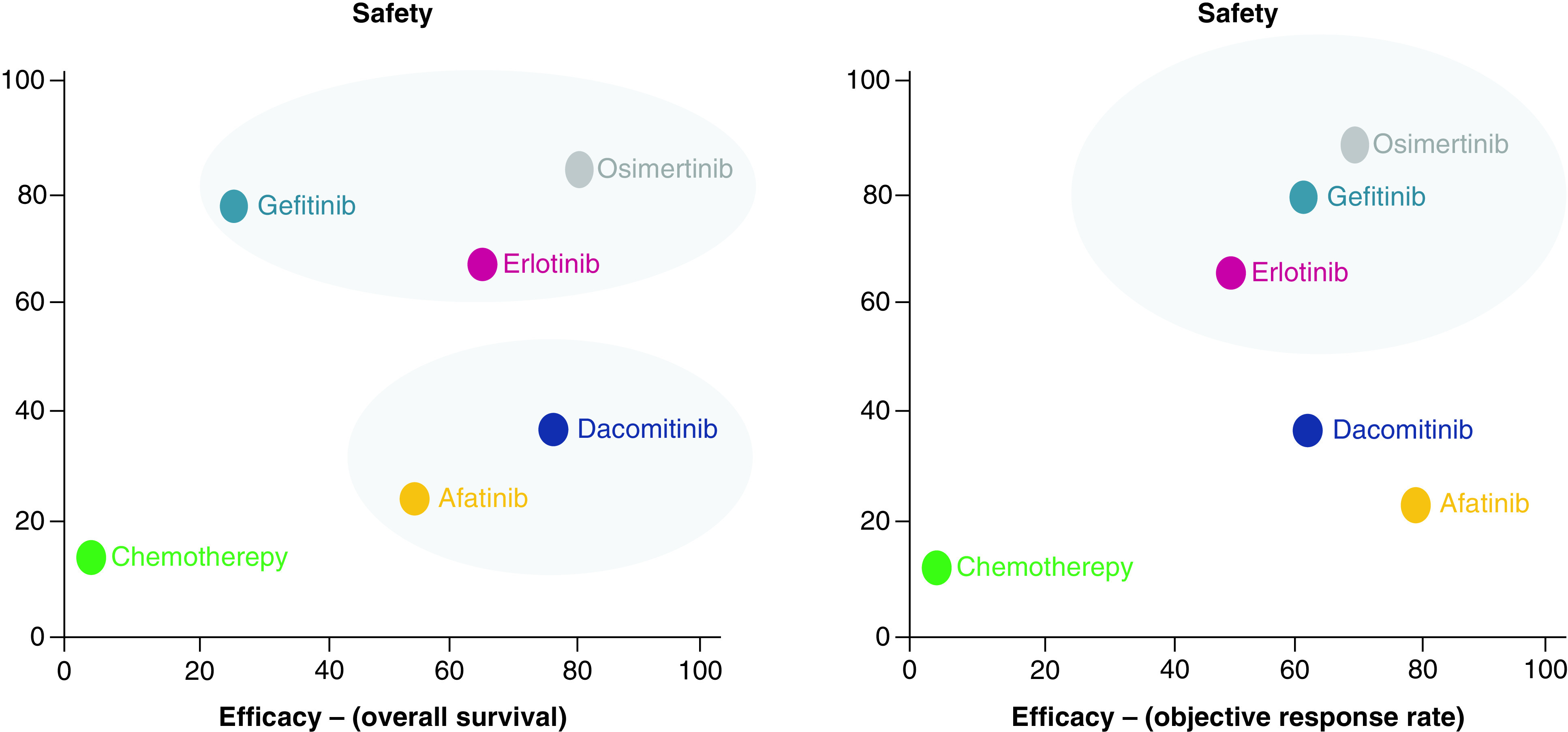
Figure 4. . Cluster plot for overall survival (OS) and cluster plot for objective response rate.

Plot shows SUCRA values on a scale of 0 – 100% for two outcomes. Each oval shap represents a group of treatments that belongs to the same cluster. The upper right quadrant represents the more effective and more safe treatments; lower right quadrant, more effective but less safe; lower left quadrant, less effective and less safe and upper left quadrant, less effective and safer.
SUCRA: Surface under the cumulative ranking curve.
