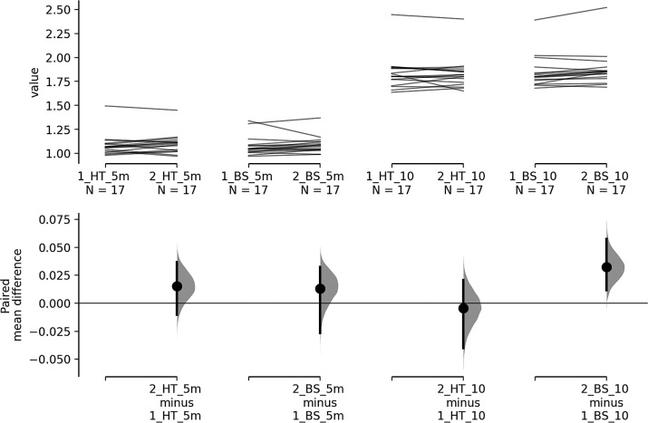
FIG 2.
Multi-paired estimation plot. The paired mean differences for the four comparisons are shown in the above Cumming estimation plot.
Note: The raw data is plotted on the upper axes; each paired set of observations is connected by a line. On the lower axes, each paired mean difference is plotted as a bootstrap sampling distribution. Differences of means are depicted as dots; 95% confidence intervals are indicated by the ends of the vertical error bars.

