Fig. 7.
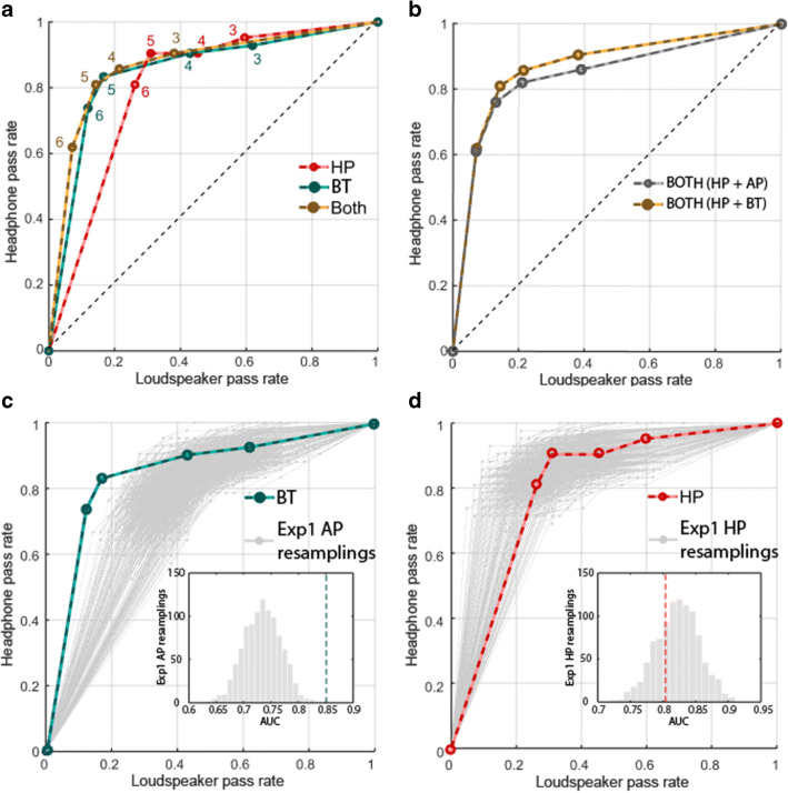
Sensitivity of HP and BT from Experiment 3 (N = 42) and comparison with Experiment 1. a ROC curves. The proportion of participants passing at each above-chance threshold (3, 4, 5, 6/6 labeled next to each data point) while using headphones (“hits”, y-axis) or loudspeakers (“false alarms”, x-axis) for HP, BT or a combined test (“Both”). b Comparison of combined tests of HP with either AP or BT. c Comparison of BT and AP: The green line shows the ROC curve for the BT test. Grey lines show 1000 resamplings of 42 subject datasets from the AP test in Experiment 1. d Comparison of HP from Experiments 1 and 3: The red line shows the ROC curve for the HP test from Experiment 3 and the grey lines show 1000 resamplings of 42 subject datasets from the HP test in Experiment 1

