
Fig. 4. Cross-cohort comparisons.
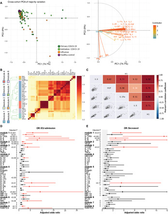
(A) Left: PCA of 35 cytokines measured across all patient groups in both primary and validation cohorts; all samples with complete cytokine data were included in the analysis, but only the majority of sample variation is included in the visualization. Right: corresponding PCA loadings indicating effects of each cytokine. (B) Correlations of log10 absolute cytokine values are visualized as the proportion of times cytokine pairs clustered together during hierarchical clustering over 1,000 permutations for all COVID-19 patients across cohorts. Colors alongside the dendrogram and cytokine names denote module membership, whereas colors within the heatmap correspond to the ratio of coclustering. (C) Cytokine cocorrelations for all cytokines assigned to Module 1 (M1) are assessed using Pearson’s correlation coefficient. (D and E) Forest plots depicting the adjusted odds ratios obtained from multivariate logistic regression analysis between cytokines and various correlates of COVID-19 disease severity. (D) Cytokine associations with ICU admission. (E) Cytokine associations with death. Logistic regression models used absolute log10-transformed cytokine values and included age, sex, ethnicity, days since symptom onset at enrollment, all reported comorbidities, and cohort as covariates. Gray shading indicates the area of the plots where odds ratios are less than 1, indicative of negative associations. Adjusted odds ratios are indicated with points, and confidence lines encompass the range between the lower and upper limits. Red indicates significance at false discovery rate < 0.1, † indicates that age was a significant covariate, and ‡ indicates that day of sampling after symptom onset was significant.