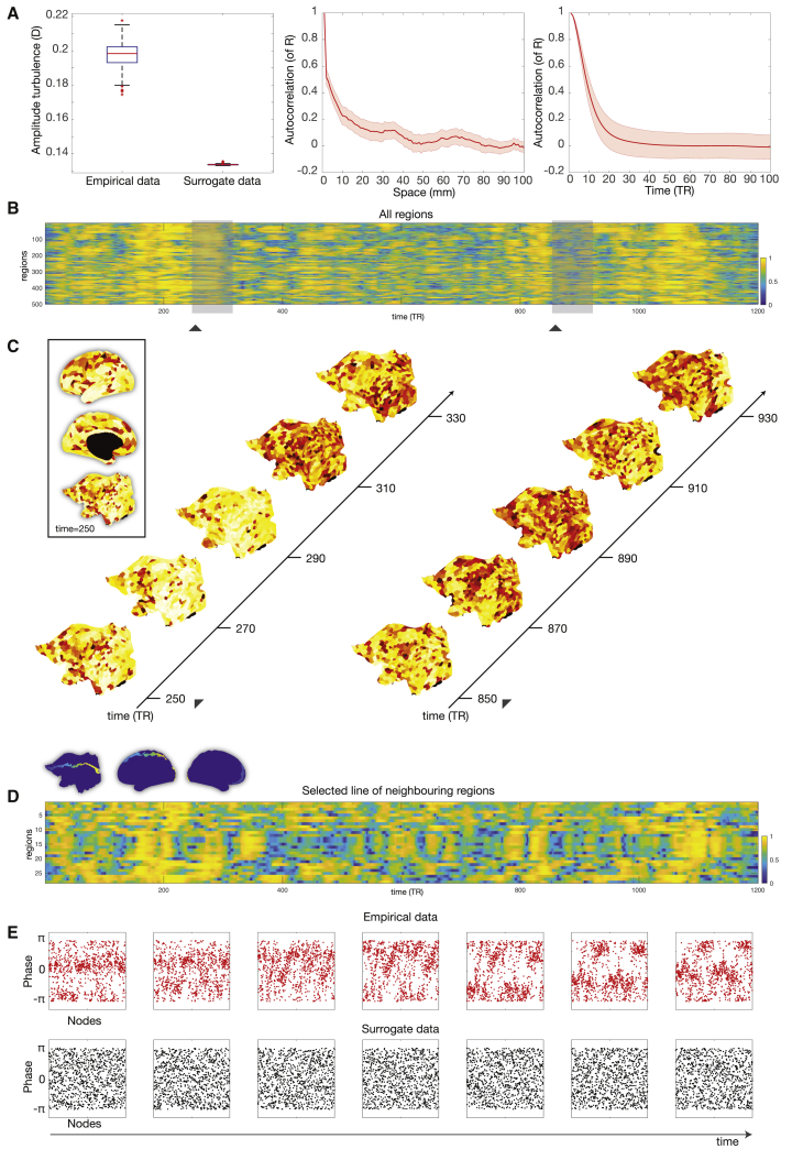
Figure 2.
Amplitude Turbulence in Empirical Data
(A) The left panel shows a boxplot of the amplitude turbulence, D, computed on the empirical resting state data of the 1,003 HCP participants and on the carefully matched surrogate data. These data are significantly different (p < 0.001, two-sided Wilcoxon rank-sum test). The central mark on the boxplot indicates the median, and the bottom and top edges of the box indicate the 25th and 75th percentiles, respectively. The whiskers extend to the most extreme data points not considered outliers, and the outliers are plotted individually using the “+” symbol. The middle and right panel show the autocorrelation of the local Kuramoto order parameter, R, across space and time, respectively (shadow showing the standard deviation). The rapid decay demonstrates an absence of regular spatiotemporal patterns in the empirical data.
(B) Visualization of the change over time and space of the local Kuramoto order parameter, R, reflecting amplitude turbulence in a single participant. Amplitude turbulence can be clearly seen in the 2D plot of all 500 parcels in the left hemisphere over the 1,200 time points.
(C) This can be appreciated from the snapshots for two segments separated in time (left and right parts) rendered on a flatmap of the hemisphere (see insert with renderings of a single snapshot on the inflated and flatmapped cortex). Furthermore, the full spatiotemporal evolution can be appreciated in the video (found in the Supplemental Information, Video S1) over the full 1,200 time points of the full resting state session.
(D) The synchronization of clusters over time is dependent on the neighborhood, and so, to further visualize the spatiotemporal evolution of amplitude turbulence, we show a 2D plot of 26 neighboring parcels running from the front to the back of the brain (see blue insert).
(E) A further demonstration of the presence of turbulence by plotting consecutive snapshots over time of the phases of all brain regions for both the empirical data (top) and the surrogate data (bottom). These graphs clearly show the absence of structure in the surrogate data and clustering resembling vortices in the empirical data (although, note that the regions are simply ordered in their original space similar to B and therefore potentially show less of the neighborhood effect shown in D).

