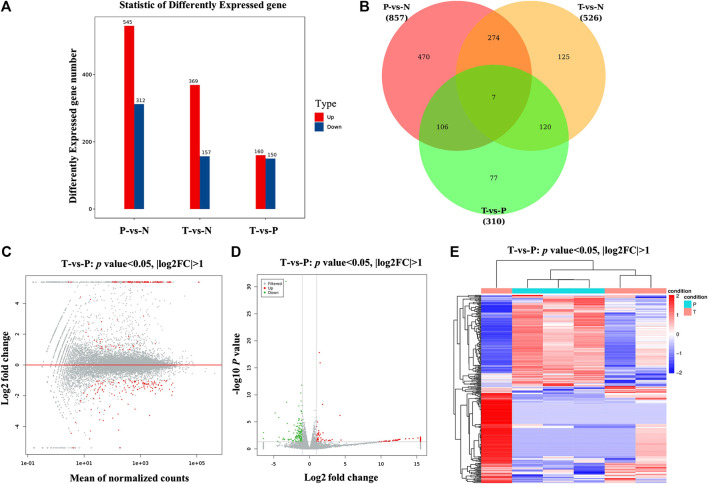
FIGURE 3.
Screening and hierarchical clustering analysis of DEGs. (A) Histogram of DEGs in groups. The horizontal axis is the comparison groups. The vertical axis is the number of DEGs in the comparison group, in which Up is the number of significantly upregulated genes and Down is the number of significantly downregulated genes. (B) Venn plots of DEGs in groups. (C) MA plots of DEGs, the horizontal axis indicated standardized expression mean in all samples, and vertical axis indicated log2 fold change. Red dots indicated significant DEGs. (D) Volcano plot of DEGs between MXSG group and pneumonia group. Red and green dots indicated significantly upregulated and downregulated genes. Gray dots indicated nonsignificant DEGs. The horizontal axis indicated where log2 fold change, and vertical axis indicated where −log10 p value. (E) Clustering analysis of DEGs between MXSG group and pneumonia group. MXSG group and pneumonia group were shown as red and cyan along the horizontal bar, and genes were shown along the vertical bar. Upregulated genes were shown as red and downregulated genes were shown as green. N, normal group; P, pneumonia model group; T, MXSG group.

