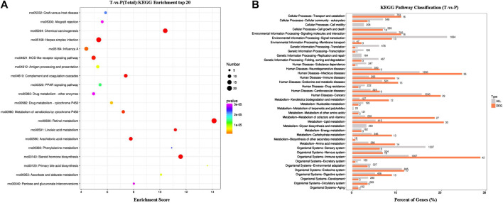
FIGURE 4.
KEGG enrichment results. (A) Bubble map of the top20 KEGG pathways. (B) Comparison of histogram of KEGG level 2 distribution between DEGs and all gene. The horizontal axis is the ratio (%) of the genes annotated to each level 2 metabolic pathway and the total number of all genes annotated to the KEGG pathway. The vertical axis represents the name of level 2 pathway, and the number to the right of the column represents the number of DEG notes under the level 2 pathway.

