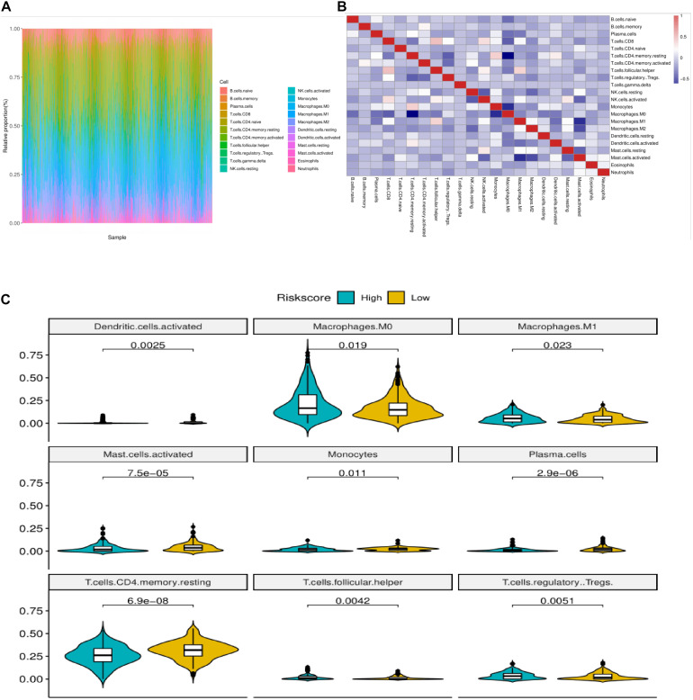
FIGURE 6.
Correlation analysis of immune infiltration in colon cancer patients with high and low risk groups. (A) Relative proportion of immune infiltrating cells in all patients. (B) Correlation matrix of 22 immune cell proportions. Red represents positive correlation. Blue is negative correlation. The deeper the color is, the greater the correlation. (C) The violin diagram of immune cells with significant difference in high and low risk group, the horizontal axis is high and low risk group, the longitudinal axis is the relative infiltration ratio of immune cells, and the p-value is calculated by wilcoxn method.

