
Figure 5.
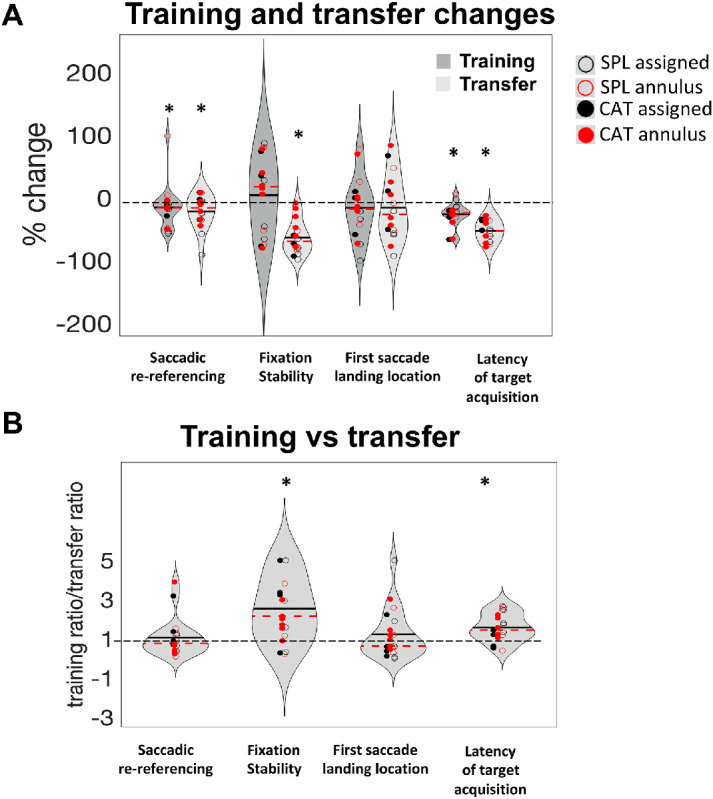
Training and transfer summary results. (A) Percentage change for the four metrics in the training (dark gray) and transfer (light gray) tasks. Differently colored dots represent the four different training-plus-induction conditions described in the Methods section. Dashed red lines in each violin represent the median, and the black lines indicate the mean. Asterisks indicate significant improvements (one-sample t-test vs. zero, α = 0.05). In this analysis (PRL-specific), the PRL with the larger number of useful fixations was chosen for each participant (see Methods), and metrics for that PRL are shown. So that all metrics plotted improvements with training as values below 0 on the graph, saccadic re-referencing (good when higher) was entered into the calculations as 100 – saccadic re-referencing, so that lower values are better. For clarity of graphical representation, three participants (P3, P17, P18) were removed as outliers (scores >3 SD from the mean). (B) Training versus transfer improvement for the four metrics. Ratios larger than one indicate that participants improved more within the pre/post assessment than in the training task; ratios smaller than one indicate that participants improved more in the training task than in the pre/post-assessment. Stars indicate significantly greater improvement in the pre/post assessment than the training task. To avoid small denominators dominating the effect, we capped the ratios at five for the three participants that exhibited ratios greater than five.