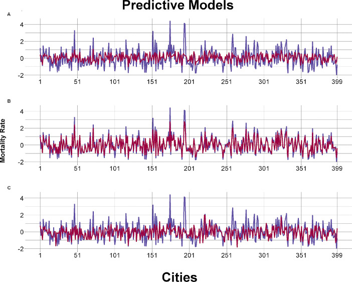
Fig 3. Calibration graphs of the tested predictive models (adjustments using RMSE).
A- Example of underfitting calibration model with the worst adjustment (K-Nearest Neighbors); B- Example of overfitting calibration model (Random Forest); C: Example of best fit model (Support Vector Machine). Blue represents the observed mortality rate and red represents the predicted one.

