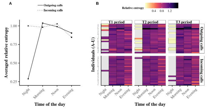
Figure 7.

Relative entropy at the individual level. Panel A shows the averaged relative entropy for both outgoing (black curve) and incoming (dashed curve) telephone calls. Panel B summarizes the relative entropy of all 21 egos in a heat map. Light (dark) colors correspond to low (high) entropy, and gray indicates missing values. Although individuals have their own alter specificity during the daytime, the average relative entropy of the population is similar, except at nighttime when too much data are missing to obtain a significant result.
