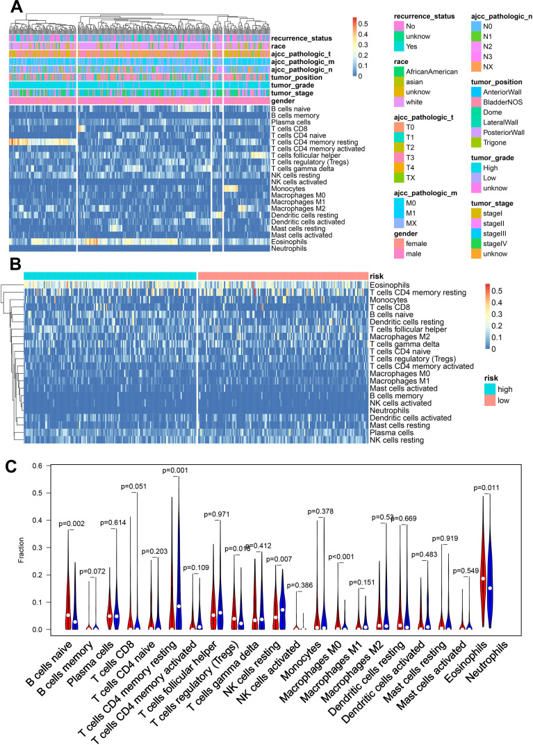
Figure 5.
Immune cell–infiltration analysis. (A) Heat map of immune cell–infiltration abundance, grouped by clinical features. (B) Heat map of immune cell–infiltration abundance, grouped by risk scores based on SMALL signatures. (C) Violin chart of abundance of each type of immune-cell infiltration in different risk groups. Red represents the high-risk group and blue the low-risk group.

