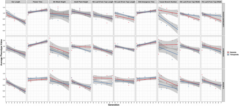
FIGURE 3.
Visualization of the interaction between ploidy and genotype in the 2008 data. Generation (x-axis) vs. averaged phenotypic values across biological replicates (y-axis) conditioned on the genetic constitution (rows) and trait (columns). Two linear regression lines are superimposed on every panel and their color indicates the diploid (red) and tetraploid plants (blue). The gray-colored band on a regression indicates a 95% confidence interval for the whole line.

