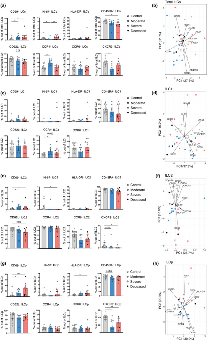
Figure 3.

ILCs reveal an activated and migratory profile in peripheral blood of COVID‐19 patients. (a) Bar plot summaries showing the percentages of the indicated markers in total ILCs in control donors (n = 16), moderate (n = 11) and severe (n = 11) COVID‐19 patients. (b) PCA plot of total ILCs from control donors (n = 16), moderate (n = 11) and severe (n = 11) COVID‐19 patients based on the cell surface markers presented in (a). (c) Bar plot summaries showing the percentages of the indicated markers in the ILC1 subset in control donors (n = 16), moderate (n = 10) and severe (n = 11) groups. (d) PCA plot of ILC1 showing the contribution of cell surface markers indicated in (c). (e) Bar plot summaries showing the percentages of the indicated markers in the ILC2 subset in control donors (n = 16), moderate (n = 11) and severe (n = 9) groups. (f) PCA plot of ILC2 showing the contribution of cell surface markers indicated in (e). (g) Bar plot summaries showing the percentages of the indicated markers in the ILCp subset in control donors (n = 16), moderate (n = 10) and severe (n = 10) groups. (h) PCA plot of ILCp showing the contribution of cell surface markers indicated in (g). (a, c, e, g) Statistical differences were tested using the Kruskal–Wallis test followed by Dunn's multiple comparisons. Bar graphs are shown as median ± IQR, *P < 0.05, **P < 0.01, ***P < 0.001. Patients with low cell numbers (fewer than 20 events) in the corresponding gate were removed from the analysis. In PCA plots, each dot represents one donor. Deceased patients in the severe group are indicated by a black dot.
