
Figure 4.
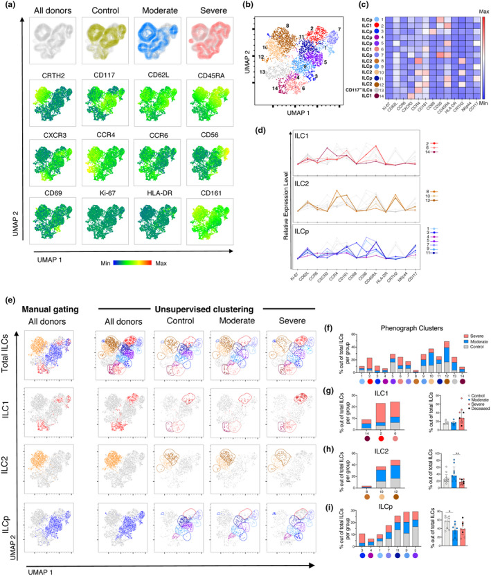
Dimensionality reduction analysis of ILCs in the peripheral blood of COVID‐19 patients distinguishes moderate and severe COVID‐19 patients. (a) Top row: UMAP of total ILCs from control donors and COVID‐19 patients (All donors), overlaid by patient groups: control donors (yellow), moderate COVID‐19 patients (blue) and severe COVID‐19 patients (pink) (from left to right). Middle and bottom rows: UMAP (All donors) coloured according to the fluorescence intensity expression (median) of the indicated phenotypic markers. (b) UMAP of the total ILCs overlaid with the 14 clusters identified by Phenograph. (c) Heatmap displaying the median of expression of the indicated markers for each Phenograph cluster. Each cluster was assigned an ILC subset identity (ILC1, ILC2, ILCp and CD117− ILC) based on the heatmap and the relative expression levels graph in (d). (d) Relative expression level of markers in the Phenograph clusters, grouped by ILC subsets (ILC1, ILC2 and ILCp). Grey lines in each graph are the rest of clusters not belonging to the ILC subset depicted. (e) Far left column: manually defined gates of total ILCs and ILC subsets ILC1, ILC2 and ILCp overlaid on the All donors UMAP in (a). Right columns: UMAP of total ILCs overlaid with the 14 ILCs clusters identified by Phenograph and displayed according to patient group (columns) and ILCs subsets (rows). Colours used for the clusters correspond to the colours used in Figure 4b–d. (f) Stacked bar graph of the percentage of all the Phenograph‐identified clusters out of total ILCs in control donors (grey), moderate (blue) and severe COVID‐19 patients (pink). (g) Left: stacked bar graph of the percentage of the Phenograph‐identified clusters belonging to ILC1 out of total ILCs in controls (grey), moderate (blue) and severe (pink) COVID‐19 patients. Right: Percentage of the sum of events corresponding to the ILC1 Phenograph‐identified clusters (14, 2, 6) out of total ILCs, in control donors (n = 5), moderate (n = 5) and severe (n = 9) COVID‐19 patients. (h) Left: stacked bar graph of the percentage of the Phenograph‐identified clusters belonging to ILC2 out of total ILCs in control donors, moderate and severe COVID‐19 patients. Right: Percentage of the sum of events corresponding to the ILC2 Phenograph‐identified clusters (8, 10, 12) out of total ILCs, in control donors (n = 9), moderate (n = 9) and severe (n = 9) COVID‐19 patients. (i) Left: stacked bar graph of the percentage of the Phenograph‐identified clusters belonging to ILCp out of total ILCs in control donors, moderate and severe COVID‐19 patients. Right: percentage of the sum of events corresponding to the ILCp Phenograph‐identified clusters (3, 4, 1, 7, 11, 9, 5) out of total ILCs, in control donors (n = 9), moderate (n = 9), and severe (n = 9) COVID‐19 patients. (g–i) Patients with fewer than 10 events per ILC subset (defined by the Phenograph‐identified clusters) were excluded from analysis. Statistical differences were tested using the Kruskal–Wallis test followed by Dunn's multiple comparisons test. Bar graphs are shown as median ± IQR, *P < 0.05, **P < 0.01.