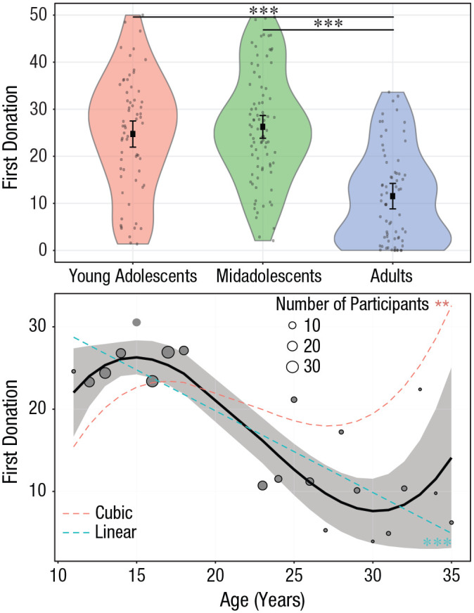
Fig. 2.

Effect of age on first donations (before participants observed what other people donated). In the top graph, age is treated as a categorical variable. Dots are individual participant means. The violin plots represent kernel probability density of the data at different values (randomly jittered across the x-axis). Within each age group, the black squares represent the fixed-effects estimates of first donations from the trial-level linear mixed model, and error bars show the corresponding 95% confidence intervals. Asterisks indicate significant differences between groups (p < .001, Bonferroni corrected). For statistics of all contrasts, see Table S1 in the Supplemental Material available online. In the bottom graph, age is treated as a continuous variable. Circles are grand means. Circle area is proportional to the number of participants; the key shows three examples for reference. The black line shows the overall polynomial trend as estimated by the trial-level generalized linear mixed model. The shaded area is the 95% confidence interval. The dashed, colored lines represent significant linear and cubic trends (**p < .01, ***p < .001).
