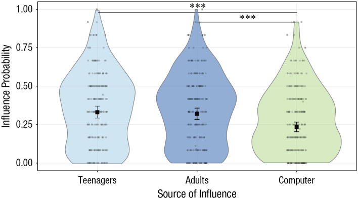
Fig. 3.
Effect of source of influence on influence probability. Dots are the frequencies of trials (%) in which participants changed their donations and conformed them with those of other donors. The violin plots represent kernel probability density of the data at different values (randomly jittered across the x-axis). Within each source type, the black squares represent the fixed-effects estimates of influence probability from the trial-level generalized (logistic) linear mixed model, and error bars show the corresponding 95% confidence intervals. Asterisks indicate significant differences between sources of influence (***p < .001, Bonferroni corrected). For statistics of all contrasts, see Table S2 in the Supplemental Material available online.

