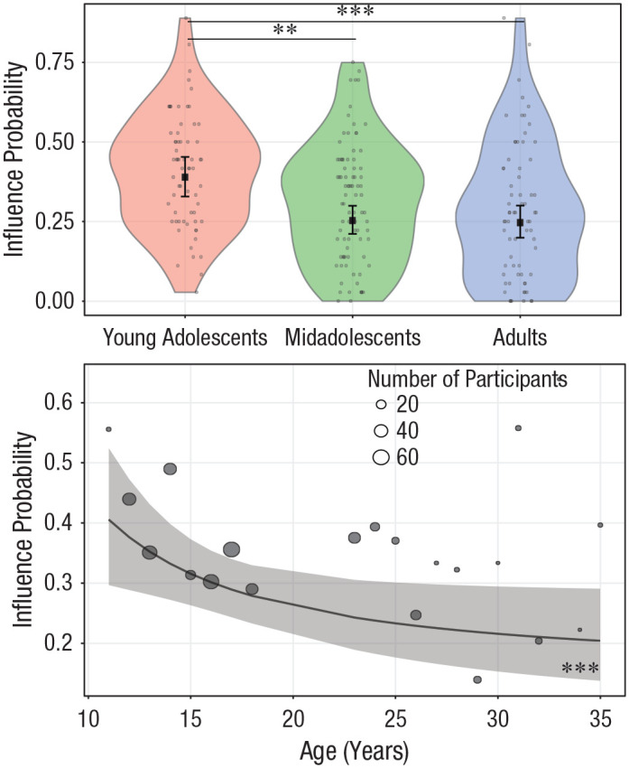
Fig. 4.

Effect of age on influence probability. In the top graph, age is treated as a categorical variable. Dots are the frequencies of trials (%) in which participants changed their donations and conformed them with those of other donors. The violin plots represent kernel probability density of the data at different values (randomly jittered across the x-axis). Within each age group, the black squares represent the fixed-effects estimates of influence probability from the trial-level generalized (logistic) linear mixed model, and error bars show the corresponding 95% confidence intervals. Asterisks indicate significant differences between groups (**p < .01, ***p < .001, Bonferroni corrected). For statistics of all contrasts, see Table S3 in the Supplemental Material available online. In the bottom graph, age is treated as a continuous variable. Circles are grand means of trials in which participants adjusted their donations to the observed donations. Circle area is proportional to the number of participants; the key shows three examples for reference. The black line shows the overall linear trend for the inverse of age as estimated by the generalized linear mixed model, and the shaded area is the 95% confidence interval. Asterisks indicate a significant trend (***p < .001).
