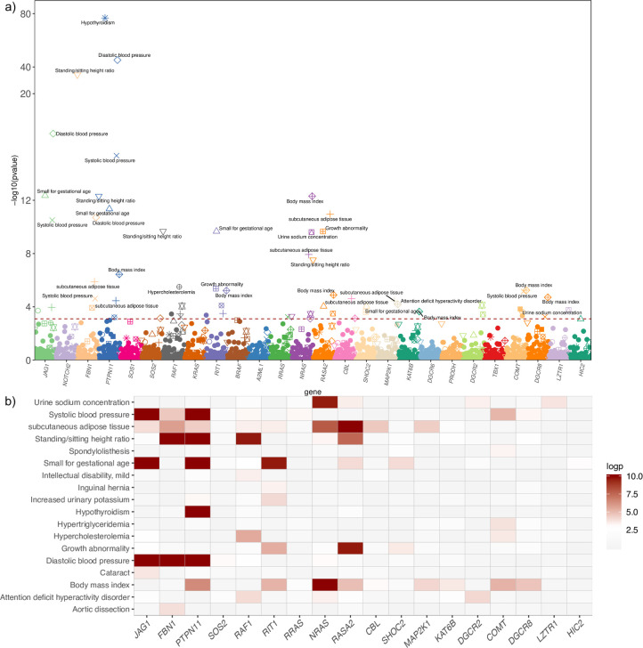
Fig 2. Primary PheWAS results at a gene level.
Plot of PheWAS results for all genes and phenotypes (a). The red line represents the level of significance after FDR correction. Genes are represented by color and phenotypes are indicated by shape. Correlation plot for the set of significant gene–phenotype pairs. (b). The color represents the p-value of association and varies from none associated (grey-white) to significant association (red-dark red).

