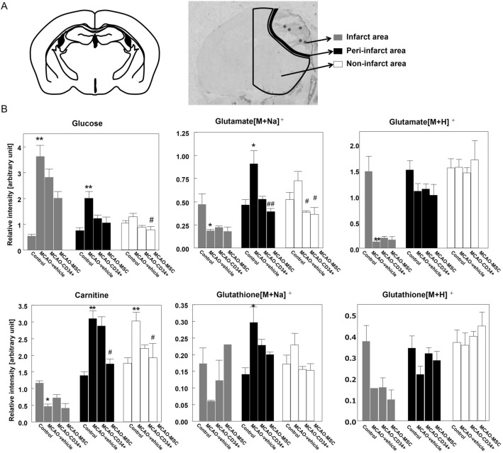
Figure 7.
Comparative analysis of the metabolites oriented by area. After visualization of the metabolites by MS imaging, we compared their relative intensities in three separate areas: the ischemic area (average of five dots), the peri-infarct area, and the non-infarct area. (A) A schematic illustration representing the region of interest (ROI) that we used. As a control, we used the contralateral sides of brains from MCAO-vehicle mice. (B) The bar graph represents the average intensity of each ROI. Data are shown as the mean ± the S.E.M. of five mice for each group. * and ** indicate p < 0.05 and p < 0.01 versus the control group, respectively, and # and ## indicate p < 0.05 and p < 0.01 versus the MCAO-vehicle group, respectively.

