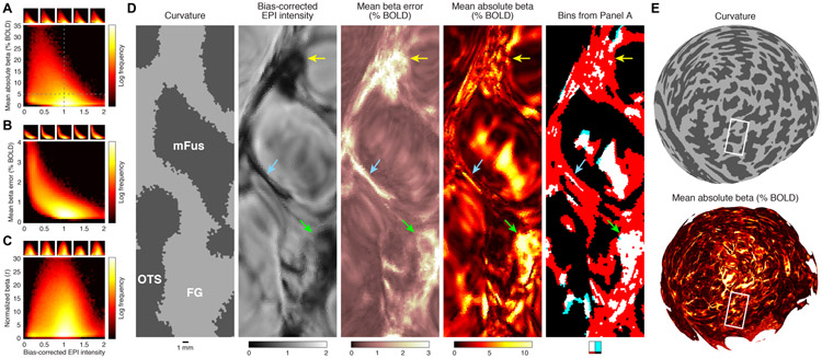
Figure 10. Quantitative summary of the relationship between static susceptibility effects and evoked BOLD responses.
A–C, Relationship between bias-corrected EPI intensity and strength of evoked BOLD responses (panel A), variability of evoked BOLD responses (panel B), and the ratio of these two quantities (panel C). Insets show results for individual subjects. In each panel, the distributions are biased towards the upper left. Notice that the distributions are complex, nonlinear, and highly non-Gaussian and are not well described by simple summary metrics such as Pearson’s r. With this caveat in mind, the group-level distributions in panels A–C reflect correlations of r = −0.31, r = −0.63, and r = −0.01, respectively. D, Detailed view of a section of flattened ventral temporal cortex (Subject S4, right hemisphere, Depth 1). The last image depicts the four partitions created by the dotted lines in panel A. The purpose of this visualization is to clarify which vertices in panel A correspond to which spatial locations in the cortical maps. As indicated by the legend below the image, the four partitions in panel A are labeled using white, cyan, red, and black. The image contains much more white than cyan, indicating that large evoked BOLD responses (mean absolute beta greater than 5%) are almost always associated with the presence of static susceptibility effects (bias-corrected EPI intensity less than 1). E, Zoomed-out view. Here we replot quantities from panel D on a posterior view of the spherical surface. The white rectangle corresponds approximately to the section visible in panel D. These plots provide a sense of scale and highlight the large amount of fine-scale detail present in the datasets.

