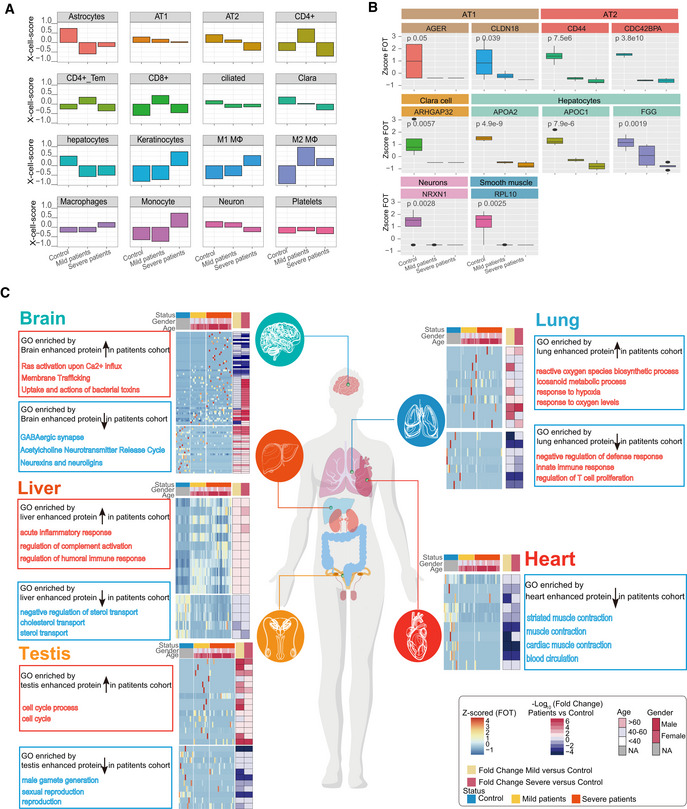
Figure 5. Patterns of tissue damage associated with COVID‐19.

- Bar plots showing the X‐Cell scores of specific cell types across control, mild, and severe COVID‐19‐infected patients.
- Boxplot showing the selected cell type specific proteins among control (n = 12), mild (n = 13), and severe (n = 18) COVID‐19‐infected patients. Differences between groups were estimated using Kruskal–Wallis test. The horizontal box lines in the boxplots represent the first quartile, the median, and the third quartile. Whiskers denote the range of points within the first quartile − 1.5 × the interquartile range and the third quartile + 1.5 × the interquartile range.
- Systematic summary of the GO pathways enriched by tissue‐enhanced proteins that exhibited altered expression among control, mild, and severe patient groups. The heatmap of each panel indicates expression patterns of tissues‐enhanced proteins among control, mild, and severe patient groups. The top panel on the heatmap indicated the age and gender information of patients. The fold changes of tissue‐enhanced proteins between mild/severe patient samples and control samples are shown on the right panel of heatmap.
