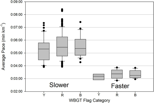
Figure 3.

Box and whisker plot of average race pacing among IIRM WBGT warning flag categories (Y is yellow, R is red, and B is black) for faster and slower EHS finishers. The dark line in the box is the median, the top and bottom of the box are 75 and 25 percentiles, respectively, the top and bottom lines are the 90th and 10th percentiles, respectively, and the circles represent outliers.
