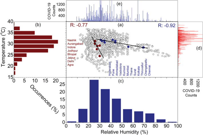
Figure 2.

(a) Scatter plot (black dots) of T and RH in 20 cities of India. The right panel shows scatter plot (deep red and deep blue dots) of T mean and RHmean and linear fits (black line), (b) percentage of occurrences of T (2 m) and during the current period (2020, deep red bar) as a function of T, (c) percentage of occurrences of RH (1,000 hPa) during the current period (2020, deep blue bar) as a function of RH, (d) total daily COVID‐19 counts as a function of T from January to 14 March to 10 May 2020, (e) represents same as (d) but for RH.
