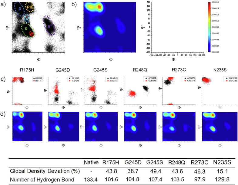
Fig. 3.
Ramachandran plots for native p53. a) Ramachandran scatter plot for native P53. A torsional angle Ψ and ϕ were plotted for all residues. The fluctuation densities were concentrated at α helix (red), β strand (blue), γ (teal), δ (green), δ′ (purple) and PII strand (orange) regions. There was a minor fluctuation concentration at δ′ regions. The axis is represented at the top right side of the figure. b) 2D Kernel density plot for native P53 transformed from Ramachandran plot. Red to purple colours represent the degree of intensity from high to low. c) Ramachandran plots of native (black), Pathogenic (R175H, G245D, G245S, R248Q, R273C) and Benign (N235S) variants (Red). d) 2D Kernel density plot for the Pathogenic variants. The table shows the structural deviation from Ramachandran plot and the H bond for each variant. (For interpretation of the references to colour in this figure legend, the reader is referred to the web version of this article.)

