
Figure 7. IFITM3 restriction of SARS‐CoV‐2 infection requires the IFITM3 amphipathic helix while enhancement of infection does not.
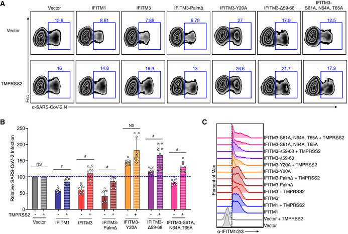
HEK293T‐ACE2‐GFP stable cells were transiently transfected with human IFITM plasmids or vector control plus TMPRSS2 or vector control for 24 h.
- Transfected HEK293T‐ACE2‐GFP cells were infected with SARS‐CoV‐2 (MOI 1) for 24 h and analyzed for percent infection by flow cytometry. Representative example plots are shown for each transfection condition.
- Graph depicts normalized infection percentage measurements from 3 independent experiments, each performed in triplicate, from cells infected as in (B). Bars represent averages with individual data points shown as circles. Error bars represent SD. The blue dotted line is added to the graph to assist with comparisons to vector control levels of infection. # P < 0.05 by ANOVA followed by Tukey’s multiple comparisons test. NS, not significant. Not indicated, additional comparisons of interest with P < 0.05 include IFITM3 (−) versus IFITM3‐Y20 (−), IFITM3∆59‐68 (−), and IFITM3‐S61A,N64A,T65A (−).
- Flow cytometry histograms showing expression of each of the IFITM constructs with the dotted line indicating gating that was used for examining percent infections in IFITM‐expressing cells.
Source data are available online for this figure.