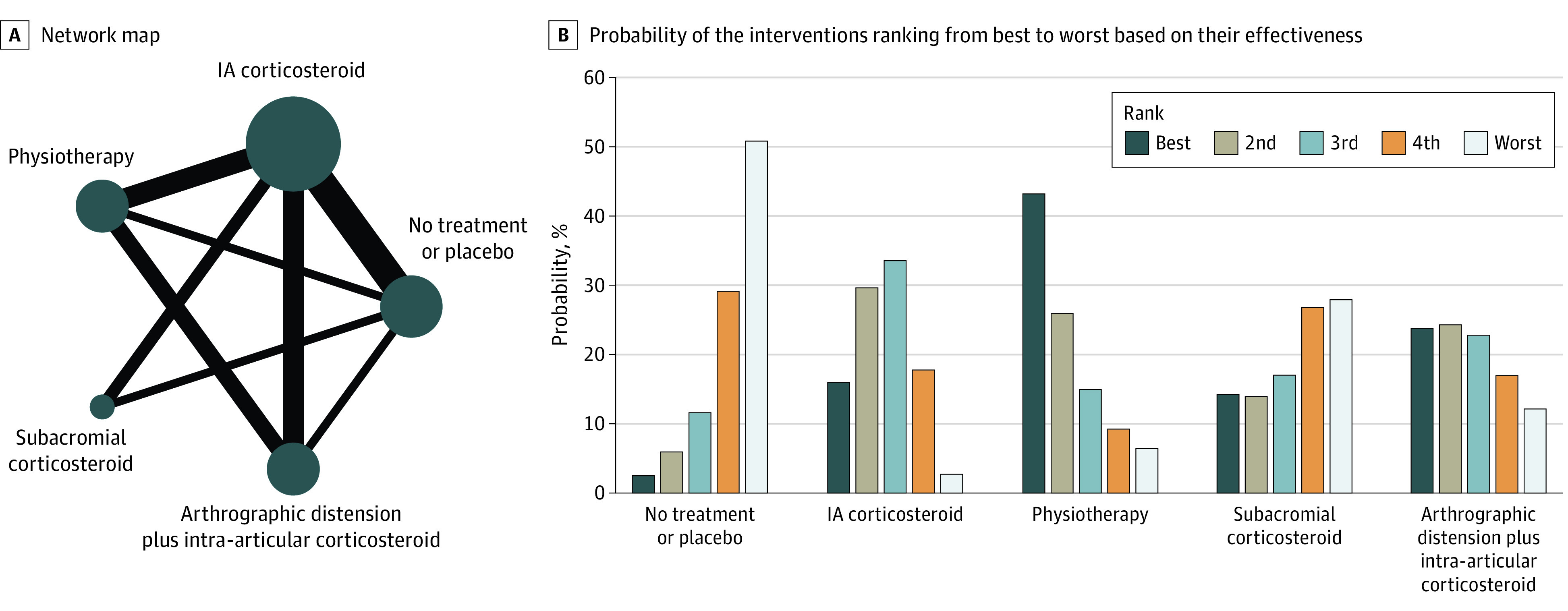
Figure 3. Results of Network Analysis for Pain at Mid-term (4-6 months) Follow-up.

A, The size of the circles denotes the contribution of participants in each intervention and the thickness of the lines between circles represents the contribution of studies comparing the two interventions. B, The bar graph shows the probability of the 6 interventions ranking from best to worst based on their effectiveness. IA indicates intra-articular.
