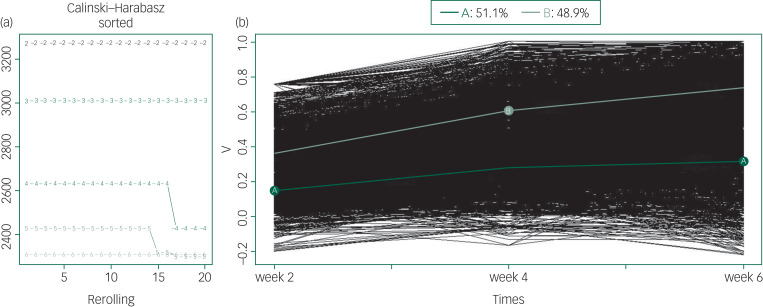
Fig. 2.
Kml trajectory analysis of treatment response (all patients).
(a) The optimal number of clusters to separate patients into groups with homogeneous treatment response over time. The x-axis represents the number of runs for two to six clusters. The y-axis represents the Calinski–Harabasz index. The curve marked with the number 2 represents the two-trajectory solution and explains the data best as it has the highest Calinski–Harabasz index. (b) The treatment trajectory of all patients. The y-axis represents the reduction rate of PANSS scale. Light green line (B) corresponds to a high trajectory or better treatment response (48.9% of patients) and dark green line (A) corresponds to the low trajectory or worse treatment response (51.1% of patients). The thin lines (black) represent individual patient profiles.

