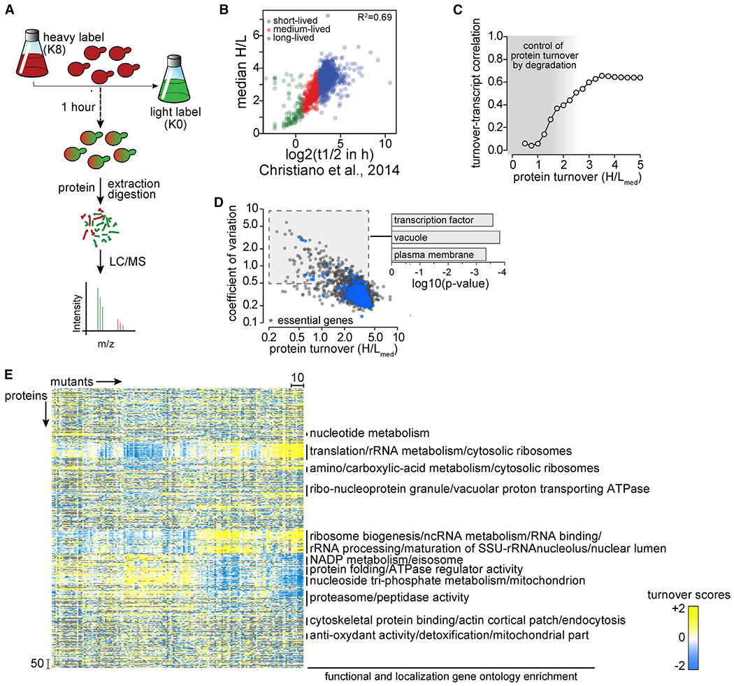
Figure 1. Overview of the Turnover Profiling Map (T-MAP) of Proteostasis Genes.

(A) Overview of single time point strategy for turnover profiling. Yeast cells were labeled for 3 days with heavy isotope lysine (K8). At t = 0, cells were washed with medium containing light isotope lysine (K0). After 1 h of chase, cells were harvested, and digested proteins analyzed by liquid chromatography-mass spectrometry (LC-MS) analysis to determine heavy to light (H:L) isotopic ratios for each detected protein, thereby enabling calculations of protein turnover.
(B) Comparison of median H:L ratios from a single (1-h) time point measurement in this study with multiple time point measurements in Christiano et al. (2014). Green, red, and blue puncta represent short-, medium-, and long-lived proteins, respectively.
(C) Distribution of Pearson correlation coefficients for pairwise turnover and expression correlations (transcript abundance; Kemmeren et al., 2014) as a function of protein turnover measurements in the present study. Gray shading indicates areas of weak correlation between mRNA levels and protein turnover, where protein abundance is controlled by protein degradation.
(D) Coefficients of variation of H:L ratios of each protein plotted as a function of the median of H:L ratios (H:Lmed). Essential proteins are in blue; other proteins are in black. p values indicate the enrichment of genes in the specific Gene Ontology categories.
(E) Hierarchical clustering of proteostasis mutants (left–right) and proteins (top–bottom). Enrichment for functional and localization categories in clusters is indicated on the right.
