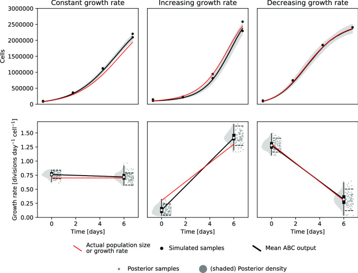
Fig. 2.
Predicted growth rates from three simulated examples. Cell counting data (black dots, top panels) were generated from population size curves (red lines, top panels) simulated from three different piecewise linear growth rate curves (red lines, bottom panels) using the forward model (Fig. 1). We then then reconstructed the most likely growth rates from the sampled data (black), but, since sampling is inherently noisy, the posterior distribution is fairly wide (grey). The dashed black lines in the bottom panels and the shaded grey section in the top panels indicate the 89% highest posterior density interval (HPDI), i.e. the smallest continuous interval containing 89% of the samples

