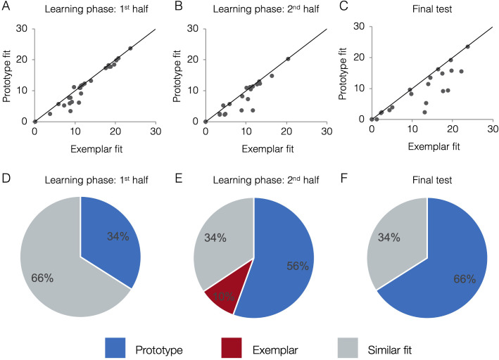
Figure 4. Behavioral model fits.
Scatter plots indicate the relative exemplar vs. prototype model fits for each subject. Fits are given in terms of negative log likelihood (i.e., model error) such that lower values reflect better model fit. Each dot represents a single subject and the trendline represents equal prototype and exemplar fit. Dots above the line have better exemplar relative to prototype model fit. Dots below the line have better prototype relative to exemplar model fit. Pie charts indicate the percentage of individual subjects classified as best fit by the prototype model (in blue), the exemplar model (in red), and those similarly fit by the two models (in grey). Model fits were computed separately for the 1st half of the learning phase (interim tests 1–2, A,D), the 2nd half of the learning phase (interim tests 3–4, B,E), and the final test (C,F). Source data for all phases can be found in Figure 4—source data 1.

