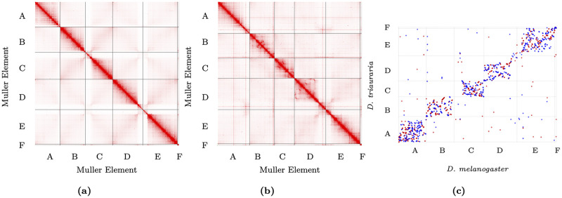
Fig 2. Hi-C contact maps and genome comparison.
A) D. melanogaster contact map; B) D. triauraria contact map. Contact maps show frequencies of pairwise 3D contacts, inferred from Hi-C data. Darker colors represent higher contact frequencies. Contact frequencies were visualized using Juicebox [39]. C) MUMmer dotplot depicting chromosomal rearrangements between D. melanogaster and D. triauraria. The promer utility from MUMmer [47] was used to visualize synteny between D. melanogaster and D. triauraria. Each dot corresponds to a one-to-one alignment between the two genomes. Red dots represent + /+ strand alignments and blue dots represent +/− strand alignments.

