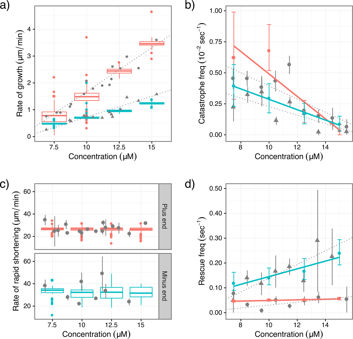
Figure 4:

Comparison between results of simulations and experiments in ref. (Walker et al., 1988). The experimental data are obtained by digitization of figures in ref. (Walker et al., 1988). Experimental data are in gray; triangles denote plus-end data and dots denote minus-end data; vertical lines are error bars and dotted lines are linear fitting from ref. (Walker et al., 1988). For simulation results, plus-end is red and minus-end is cyan. Growth and shortening rates are presented as standard box plots; frequencies for catastrophe and rescue are presented as error bars. Simulations are carried out at tubulin concentration of 7.5, 10.0, 12.5 and 15.0 μM. Linear regression (solid lines) was conducted on catastrophe and rescue frequencies. (a) growth rates; (b) catastrophe frequencies; (c) shortening rates; (d) rescue frequencies.
